MEI Copiloto
Mobile-first assistant for Brazil's solo self-employed workers: schedule, clients, money, and tax deadlines in one app.
My Role
Design Engineer, freelance. Branding through front-end, working alongside a Designer Engineer, same AI-first/IDE-agnostic build model as my other healthtech work.
Product walkthrough
Landing page and waitlist flow: hero, WhatsApp-style chat mock, how-it-works steps, and signup form.
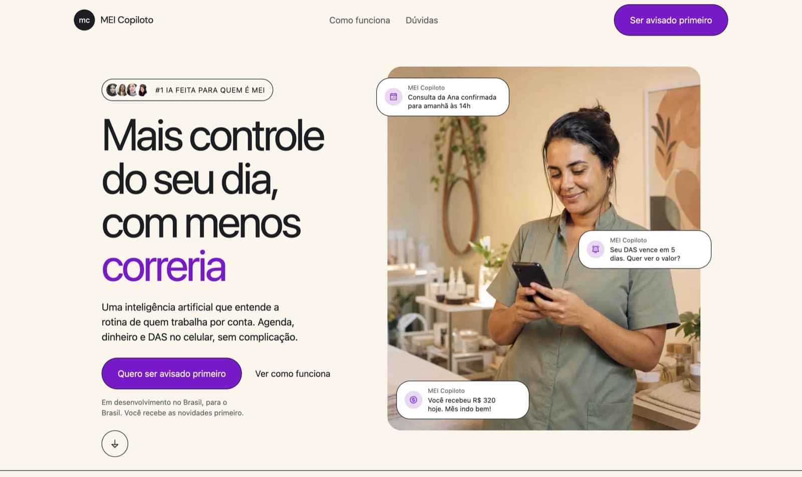
Hero, desktop
"Mais controle do seu dia, com menos correria" headline next to a WhatsApp-style mock showing agenda, DAS, and money nudges.
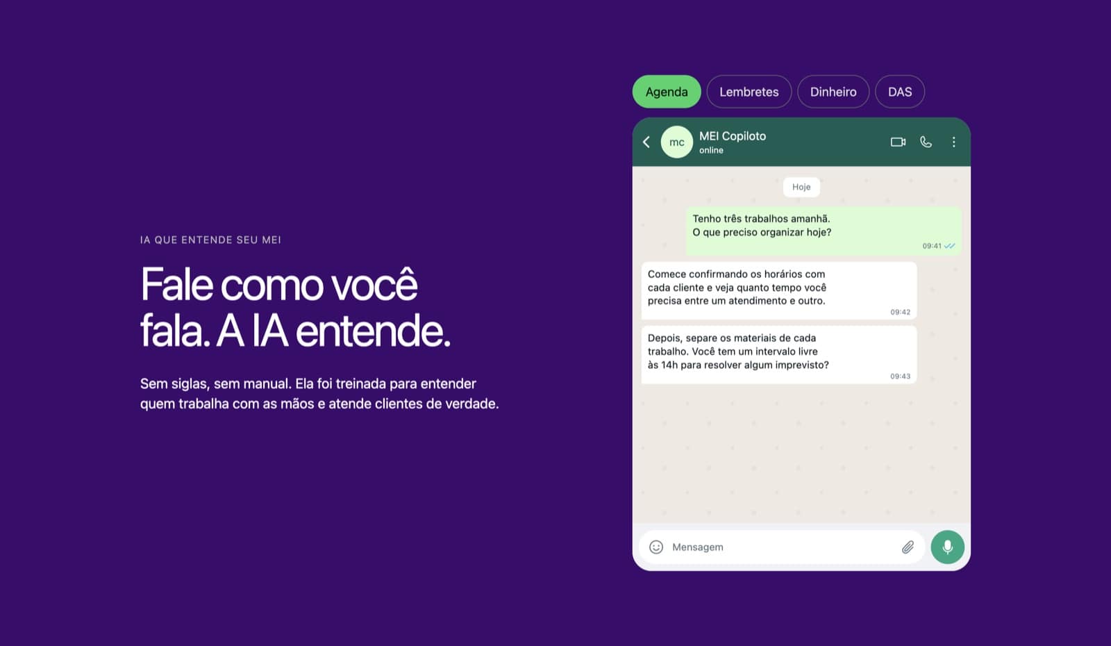
Chat interface close-up
Dark purple section showing the Agenda/Lembretes/Dinheiro/DAS tabs and a sample WhatsApp conversation.
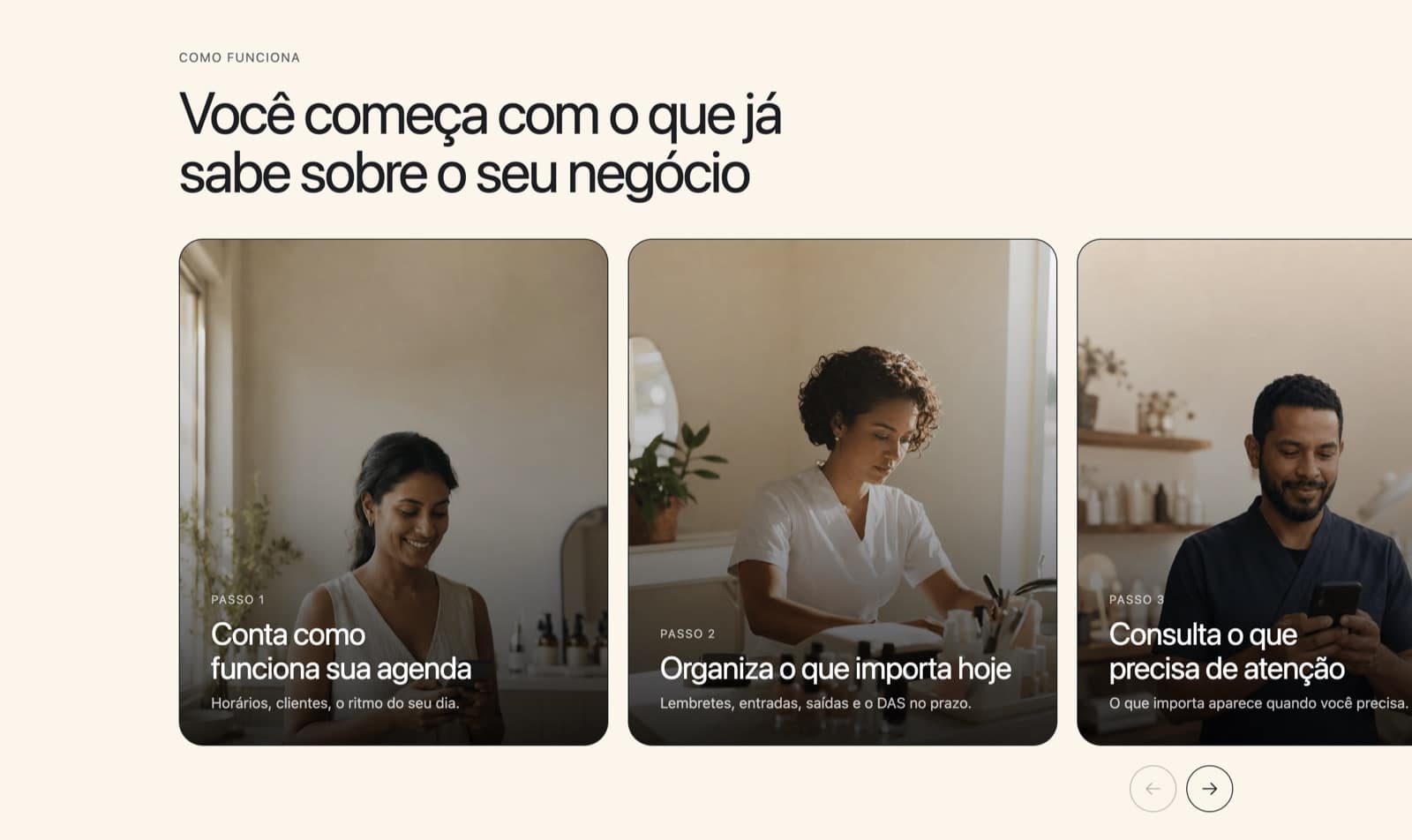
How it works, three steps
Passo 1 to 3: tell it your schedule, it organizes what matters today, you check what needs attention.
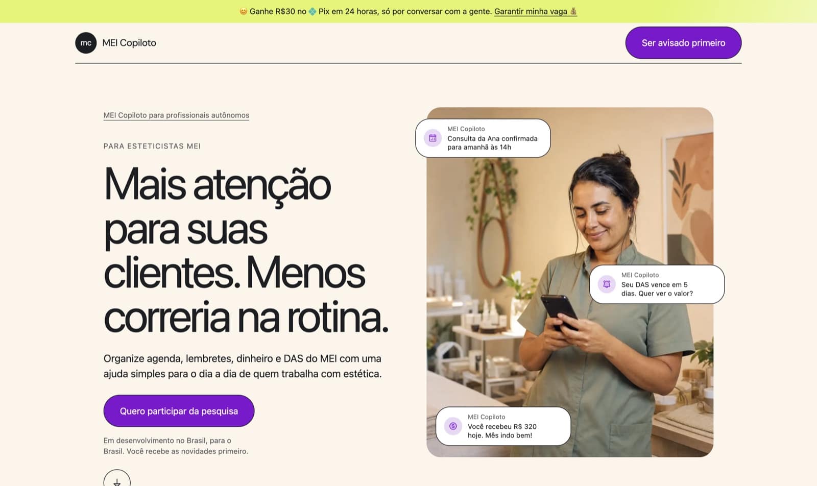
Segmented variant with incentive banner
Aesthetician-specific headline with a top banner offering R$30 Pix for a 30-minute research call.
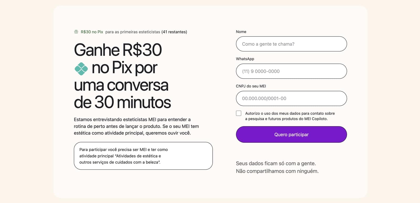
Research call signup form
Name, WhatsApp, and CNPJ fields with an eligibility note and a remaining-spots counter.
From moodboard to design canon
This one skipped Figma. The client had already gathered a Pinterest moodboard pointing at a neo-brutalist direction, so instead of rebuilding that intent inside a design tool, I took the moodboard straight to approval and then wrote it down as code-adjacent truth: a DESIGN.md design canon, before a single component existed. Every rule in it became a constraint the build had to obey, not a suggestion to interpret later. A single purple reserved for the primary call to action and nothing else, a warm cream floor instead of white, zero gradients, zero shadows, and exactly two border-radius values for the entire interface. Writing the canon first meant the whole system fit in one person's head, which is what let the build move as fast as the brief demanded.
Narrative and microcopy
The audience here has their hands full and their attention split between a client in front of them and a phone in their pocket. Every section had to earn its place: problem stated before solution, four concrete pillars named plainly (agenda, reminders, money, the DAS deadline) instead of a generic features list, and nothing that would need walking back later: no invented testimonials, no fabricated client counts, no pricing pulled from thin air.
Built in 24 hours, without AI-slop
The brief: ship a complete, on-brand, neo-brutalist landing page in a day. Started from a client-approved Pinterest moodboard instead of Figma, translated directly into a written design canon (DESIGN.md) before a single component was built.
Stack
Next.js
App Router with Turbopack. Server Components by default, mobile-first landing page shipped without a backend.
React
Component model for the client-side interactivity: waitlist form state and validation.
Tailwind CSS
Utility-first styling for the neo-brutalist layout: borders, spacing, and the two-radius token system.
daisyUI
Component layer on top of Tailwind: buttons, inputs, and cards pulled from the catalog instead of custom CSS.


